I have been playing with the idea of getting a personal website for a while now. The concept of personal websites seems to have lost appeal in recent years, due to the omnipresence of social media sites and universities allowing some space on their website for some key points. However, it seems that most self-respecting academics still operate personal websites. After tweaking my own profile I learned what could be one of the reasons: I tried to show it to a friend and failed miserably to find it again in the maze that is the UoG website (which is not worse than most other university’s site I’ve seen).
Additionally, It seems that a blog offers the chance to get some smaller ideas out there in a concise and straightforward form. It has also become clear in the last few months in the PhD that I learn much more than I can possibly remember over time. This makes a blog valuable as I can track myself, what seemed important at some point. And additionally, I’m hoping to get some practice writing (in a foreign language).
So when I read about blogdown—which is an R package that makes it easy to set up and manage websites—I thought I might give it a try. And in fact, due to Yihui Xie’s wonderful online book setting up a blog or personal website means you just have to execute a couple of commands in R (which is my favourite thing to do anyway) to get a personal site that includes space to share information about myself, my research and have a nice spot to share some of my endeavours in academia or with R.
One major upside of this approach is that it is quick and easy to share R code and the plots it creates. This, for example, is the code to one of my favourite plots: a proportional stacked area graph.
# Load libraries
library("ggplot2")
library("RColorBrewer")
library("dplyr", warn.conflicts = FALSE)

# Make some data
set.seed(123)
df <- data.frame(
  frame = rep(LETTERS[1:5], 20),
  year = rep(1991:2010, each = 5),
  value = runif(100,  10, 100)
)

# Add proportion
df_prop <- df  %>%
  group_by(year, frame) %>%
  summarise(n = sum(value)) %>%
  mutate(share = n / sum(n))

# Plot proportional stacked area graph
ggplot(df_prop, aes(x = year, y = share, fill = frame)) +
  geom_area(position = "stack", alpha = 0.6, size = 1, colour = "black") +
  scale_y_continuous(labels = scales::percent) +
  scale_fill_brewer(palette = "Dark2") +
  scale_x_continuous(breaks = scales::pretty_breaks()) +
  theme_bw() +
  labs(title = "Share each frame occupies in the media discussion", x = "", y = "")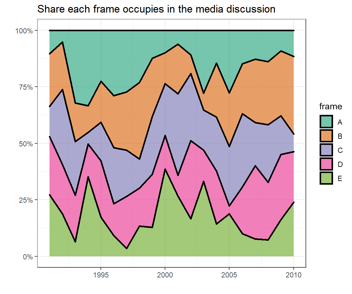
I used it to present my main findings in my dissertation for the MSc and still think it is one of the best to show which frames dominate a discussion. The space each concept fills in a year represents which proportion of all observations belong to it. Independent from the actual amount of observations in a year. Or at least this is the idea of it (the plot above only shows random data).
So with this post, I start off my page, even though I have no illusions of anyone finding it soon. At least not until I can manage to get a few publications or create some interesting content.